“Imagination is the only key to the future. Without it none exists – with it all things are possible.”
— Ida Tarbell.
Hello everyone, welcome to my blog! On this site you can expect regular blog posts about my life and my journey to becoming a digital media professional this semester in JMS 315W. All blog posts can be found inside of the tab on the left side of this page title “Blog Posts.”
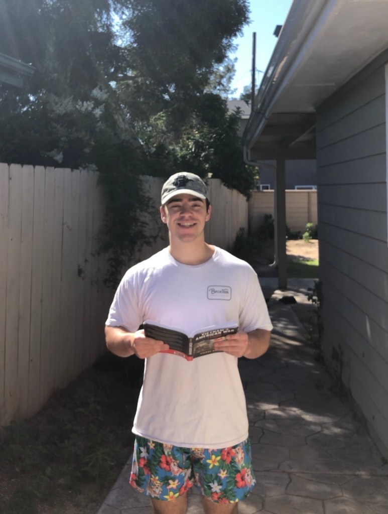
The image above pictures me in my new study spot, my own home. The image represents my digital self as itdisplays me in my new habitat this Spring semester. Now that San Diego State has moved all of its classes online, I’ve had to adjust to doing school work at home. Putting myself in an environment conducive to focus, such as the library has been one of my key goals to academic success throughout college, but due to my new circumstances, I’ve had to adjust to working at home.
One of the digital media principles that this image focuses on is depth of field. Depth of field is defined by Multimedia Foundations: Core Concepts for Digital Design, as, “the area of a scene in front of and behind the main subject in focus,” (Costello, 316). Specifically this image presents a great depth of field, meaning noticeable portions of the majority of the scene are sharply defined. Additionally, this image focuses on the rule of thirds-composition. The rule of thirds composition states that the main subject of the image should be centered on one of the points in which the grid lines meet on a digital camera, as this is where the viewers eyes naturally go.
Listen to my revised podcast interview about the current state of safety for healthcare workers amidst the COVID-19 pandemic:
This audio represents my digital self, as it is an interview with a family member that I have a close personal relationship with, my dad. Additionally, this audio is a representation of my virtual self, in that it is an interview with an expert healthcare worker during what is surely one of the most volatile global situations I have experienced during my young life
The first principle of audio production I followed was the sound check. I began by prompting my subject to speak. I then referenced the VU meter to see the loudest points of my subjects speech, which I then edited in post production to keep a consistent speech level throughout the podcast’s entirety (Costello, 401).
The second principle of audio production I followed to create my mini–podcast was related to the equipment. Specifically, I employed the use of analog-to-digital converter microphone, or a USB microphone. This allowed me to pick up clear audio without any outside noise interfering (Costello, 394). Additionally, I have revised this podcast to feature intro and outro music so that the podcast itself is more pleasing for the listener.
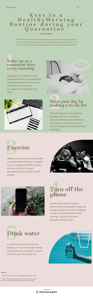
During the COVID-19 Pandemic, I found that my own personal routine had been thrown out of rhythm. I had previously structured my days based upon class time, meeting times, and study time. Now that SDSU has gone completely online, my class and meeting scheduled has become more or less flexible. The first week of quarantine, I found myself wasting my morning by sleeping in, and spending too much time scrolling through social media once I finally woke up. Rather than letting the new circumstances I found myself in get the best of me, I decided that this would be the perfect time to develop a new morning routine. Above is an infographic that lists my personal tips to develope a good morning routine, and the benefits of each habit.
For the infographic, I followed the principle of raster image formatting by downloading my image as a PNG file. The PNG file was conducive to displaying a graphic with a multitude of colors (Costello, 279). I also made use of the design principle of negative space. I made sure my infographic had plenty of negative space in order to let the image breathe, allowing readers to not become too overwhelmed by the information being presented (Costello, 118). Additionally, I have revise this assignment to include less text, as the text previously provided too much clutter on the screen.
My digital self is a virtual, outward expression of my constantly developing and changing circumstances. I anticipated this spring semester to be one of my most difficult academic challenges to date. I was right in believing this, but I did not foresee my environment being changed so quickly by the COVID-19 pandemic. My initial digital assignment, along with my recently revised digital assignment, perfectly reflect this academic challenge and my rapidly changing environment. When I first posted my digital assignment, I was pictured in what I would call my element. That is the fourth floor love library with a book in hand; this was the spot I called home when it was 11:00 p.m. and I was running on fumes. In my revised digital assignment, my environment has shifted, as I’ve been forced into the isolation of my home, but what remained constant was my book in hand, as my school work did not slow as a result of COVID-19.
By the time I reached the digital audio assignment, the world around me had shifted, and I found myself back at home interviewing my father, a nurse battling COVID-19 on the front lines. Similarly, my infographic assignment reflected my personal attempt to adjust with my new environment. I had, at the time, been looking for new routines to keep myself driven and motivated under the changing circumstances. The infographic assignment was a visual that reflected a new habit that I was attempting to develop in order to adjust.
I would have never predicted my semester to go this way, and all three of my assignments reflected my environment and personal habits changing. These assignments are my digital self, a virtual, outward expression of my constantly developing and changing circumstances.
The most important way JMS 315 has helped me understand digital media principle designs is through the creation of my own digital content. Prior to this class, I had very limited experience with podcasts and absolutely no knowledge of how to create something like an infographic. Through lectures and class reading I was able to understand the principles that define these pieces of digital content, and then apply them to my own creation of the content. This allowed me to see theoretical principles come into fruition, providing an invaluable lesson in digital content creation.
The design principles that resonated with me the most were the five design principles of an infographic; it’s truthful, functional, beautiful, insightful, enlightening. I’ve always found infographics to be super helpful in developing my understanding of a topic, but when I initially came around to making my own. I found myself adding unnecessary information and visual aspects. I sat on my rough draft of the infographic for a day, and when I returned to edit it, I went through each word and graphic and asked myself, “Is this furthering at least one of the five design principles of an infographic?” If the answer was no I cut it out, and what I was left with was my final infographic that I now have printed up on my own bedroom wall to help maintain consistency in my new morning routine.
My Assignments
When creating my digital image assignment I found myself stuck at ground zero, as I had no idea how to come up with a single image that would represent who I was digitally, this was the most challenging moment of the assignment. At the time I was sitting with three friends in the love library doing homework. I was speaking to them about the assignment when one of my friends made the remark that we don’t really do anything except sit in the library all day. Immediately I realized that the best digital image would be me in the library, which ended up being the setting for the picture. For the picture I used my iPhone camera because of its simplicity and convenience. The most enjoyable moment of the assignment was jumping up and down several times until my friend could get a picture of me in a still frame that made it look as if I was hovering over the ground.
During the time I was creating my audio assignment, California had just issued its stay at home orders, and my home town, Fresno, CA, had gone on lockdown. I made the journey back home to be with my family during the unprecedented circumstances. At the time a lot of media attention was being focused on frontline healthcare workers. Being that both of my parents are registered nurses, I figured I would sit down with my dad and talk about his opinion on the safety of frontline healthcare workers amidst the COVID-19 pandemic. For the assignment I used a Blue Snowball USB microphone for clear audio, and Garageband to end and export the audio, which was a convenient application to use as I already had it downloaded on my mac and had prior experience using it. The most challenging moment of the assignment came about during its recent revision. Adding the music to the audio file was easy, but figuring out how to fade the music in and out at the appropriate time was difficult. The most enjoyable moment of my assignment was watching my dad listen to his own voice in a podcast from his phone. He thought it was the coolest thing ever.
While creating my infographic assignment, I also used my new circumstances that came about as a result of the COVID-19 pandemic for inspiration. At the time I was struggling to get myself going in the morning without the motivation of making it to class on time. I began searching the web for help to create a new morning routine that would work for me. The tips I pulled from this search ended up being the base for my infographic assignment. To make the infographic assignment I used the website Piktochart. I found Piktochart to be very user friendly, and I thought its design templates to be much better than Canva’s. The most challenging aspect of the assignment was finding research that would back the morning routine tips I was promoting. Finding the source material took a couple hours. The most enjoyable aspect of this assignment was sitting down and really thinking through the development of my own personal routine. Since I created this infographic, I’ve been to the habits I outlined, and they’ve paid dividends.
I cannot believe it’s already week 12 of the semester, things have flown by! This week we began studying user experience (UX), and its importance to digital media professionals. According to class lecture, user experience focuses on the overall experience has with an interface, in contrast to last week’s study of user interface, which focused on an interface’s specific layout and design.
The study of UX principles made me consider some of the interfaces I typically use, and whether or not these provide me with a good experience. This first interface experience that came to mind was Blackboard, a site I use on a daily basis. While Blackboard has a simple layout, the overall experience it provides, in my opinion, is awful. While Blackboard has several experience issues, I believe its most outstanding issue is that from semester to semester, thing are extremely difficult to locate. I’m excited to see what San Diego State’s switch to Canvas brings, hopefully a more user friendly experience.
As of the time I’m writing this post, there are exactly three weeks left in my semester, and while this was not how I expected things to go, I can honestly say that I’ll miss this semester’s studies. Best of luck to everyone entering finals!
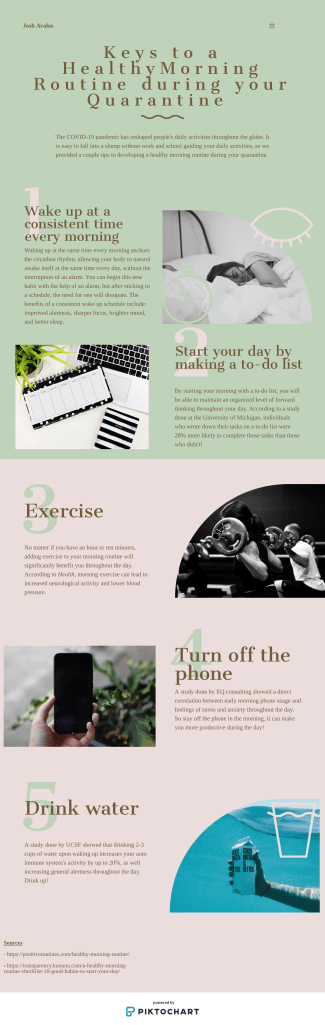
During the COVID-19 Pandemic, I found that my own personal routine had been thrown out of rhythm. I had previously structure my days based upon class time, meeting times, and study time. Now that SDSU has gone completely online, my class and meeting schedules had become more or less flexible. The first week of quarantine, I found myself wasting my morning by sleeping in, and spending too much time scrolling through social media one I finally did wake up. Rather than letting the new circumstances I found myself in get the best of me, I decided that this would be be the perfect time to develop a new morning routine and habits. Below is an infographic that lists some of my personal tips to developing a good morning routine, and the benefits of each habit.
For the infographic, I followed the principle of raster image formating by downloading my image as a PNG file. The PNG file was conducive to displaying a graphic with a multitude of colors (Costello, 279). I also made use of the design principle of negative space. I made sure my infographic had plenty of negative space in order to let the image breathe, allowing readers to not become too overwhelmed by the information being presented (Costello, 118).
Hello everyone! I hope you have all been staying safe and practicing social distancing during these unprecedented times. Much like the virus itself, I too have not stopped working. Last week I began studying usability and its relevance to media professionals in the age of technology.
According to class lecture, usability is, “a measure of a persons experience with a user interface from software to hardware.” This definition immediately brought to mind all of the technology I use on a daily basis. The iPhone with its seamless user interface, and the Windows PC with its intuitive and interactive operating system. While these gadgets surely do add value to my life with their friendly usability, I began to think back a step about other pieces of technology in my life that I take for granted.
I read the article, “What is universal usability,” this week, and it simply defined usability as, “the measure of a tools effectiveness.” I was holding my beloved Hydroflask in hand at the time I was reading this article, and I began to think about its design. Easily re-screwable cap at the top with a nice handle on it, as size that holds the perfect amount of drinking water, a durable frame. The Hydroflask was so easy and convenient to use that I had never even actually given thought to its design. That is great usability.
Hello everyone! I hope everyone is say and in good health during these trying times.
This audio represents my digital self, as it is an interview with a family member that I have a close personal relationship with, my dad. Additionally, this audio is a representation of my virtual self, in that is an interview with an expert healthcare worker during what is surely one of the most volatile global situations I have experienced during my young life.
The first principle of audio production I followed was the sound check. I began by prompting my subject to speak. I then referenced the VU meter to see the loudest points of my subjects speech, which I then edited in post production to keep a consistent speech level throughout the podcast’s entirety (Costello, 401).
The second principle of audio production I followed to create my mini-podcast was related to the equipment. Specifically, I employed the use of analog-to-digital converter microphone, or a USB microphone. This allowed me to pick up clear audio without any outside noise interfering (Costello, 394).
Hello everyone! This week in my journey to becoming a multimedia professional, I began studying audio. While going through my lectures and doing my readings some things jumped out to me about audio that I had not previously considered. In this day and age, microphones are seen just about everywhere, but I had not put much thought into how these devices work. It turns out microphones perform their functions through a process called transduction. Transduction is the process of converting an acoustical waveform signature’s sound into an electrical voltage signal that represents the amplitude and frequency imprint of the recorded sound. This is the process that has allowed for audio to become such a prominent medium in today’s world.
While focusing in solely on the medium of audio it became apparent to me that, while media is increasingly converging, audio by itself has become increasingly important in the modern media landscape. As radio in its traditional sense has faded away, the podcast has made its rise to popularity. The market for podcasts has grown exponentially over the last several years, and it is now in the best interest of every media professional to have a strong grasp on audio in general and how it pertains to podcasts specifically.
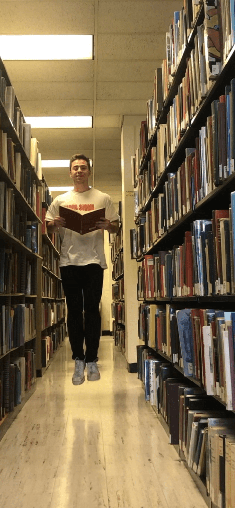
The image above pictures me in my favorite study spot, the fourth floor table section of the love library. The image represents my digital self as it displays me in my natural habitat this Spring semester. Due to my heavy workload this semester, I’ve spent a large portion of my free time studying and working on my assignments. As an individual, I’ve found it easier to commit myself to my school work in a setting like the library, as it limits the outside distraction that I would be otherwise exposed in a setting such as my own bedroom. Putting myself in an environment conducive to focus has been one of my key goals to academic success throughout college.
One of the digital media principles that this image focuses on is depth of field. Depth of field is defined by Multimedia Foundations: Core Concepts for Digital Design, as, “the area of a scene in front of and behind the main subject in focus,” (Costello, 316). Specifically this image presents a great depth of field, meaning noticeable portions of the majority of the scene are sharply defined. Additionally, this image focuses on the rule of thirds-composition. The rule of thirds composition states that the main subject of the image should be centered on one of the points in which the grid lines meet on a digital camera, as this is where the viewers eyes naturally go.
Hello everyone! Now that I’ve finished the courses section on on digital media foundations I’ve had some time to reflect back on the classes readings and overall learning objectives. As a whole the first three modules of the class taught me a great deal about the base foundations that today’s current multimedia landscape is built upon.
The classes most recent readings, Multimedia Foundations, Chapter Eight, introduced concepts that I have previously over looked. The chapter touched on the subject of typography, which is defined as, “the art of deigning and arranging type,” (Costello, 236). At first glance, I thought the subject would be something I had already understood through my years of working with fonts on a computer, but shortly after beginning my readings, I realized that the letters presented on a screen, or through print media, help to structure specifically tailored messages. For instance, the Serif typeface, notably used by the New York Times, as well as this blog post, helps to present a more serious message. In contrast, the Sans Serif typeface, notably used by USA Today, presents a more modern and current styled message. The different uses of typeface exemplifies some of the nuanced topics, that hold serious weight in todays multimedia landscape. Chapter eight helped me understand the idea that, no matter how small the detail may seem when it comes to crafting a message for any form of media, there is a level of importance that should not be overlooked.
Hello Professor Schmitz Weiss! I look forward to working to build my skills as a digital media professional this semester. There are some specific aspects of the class I’m particularly excited for, but I’d like to first introduce myself as an individual. My name is Joshua Avalos, and I was born and raised in Fresno, CA. I am a third year student here at San Diego State, majoring in journalism with a minor in history. I would like to consider myself a student leader on campus, as I am currently serving as the Vice President of Finance for the College Council of PSFA, and the Associated Students Representative of PSFA. Professionally, I aspire to attend law school after I complete my undergraduate studies.
My general expectations as a student in JMS 315W are to develop my skills in multimedia design, as it pertains to the field of journalism, as well as learning how to effectively apply these skills as a practicing journalist in the real world. I’m particularly excited to engage with the creative aspects of this class when it comes to creating multimedia content, as well as learning new methods of digital content creation. I can’t wait to see what this semester has in store, and I hope you enjoy my future blog posts!